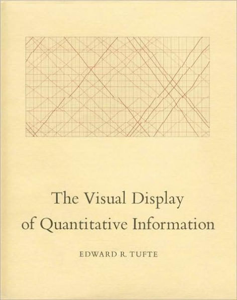
The Visual Display of Quantitative Information / Edition 2

The Visual Display of Quantitative Information / Edition 2

by Edward R. Tufte
ISBN-10:
0961392142
ISBN-13:
9780961392147
Pub. Date:
01/28/2001
Publisher:
Graphics Press
ISBN-10:
0961392142
ISBN-13:
9780961392147
Pub. Date:
01/28/2001
Publisher:
Graphics Press
The Visual Display of Quantitative Information / Edition 2

The Visual Display of Quantitative Information / Edition 2

by Edward R. Tufte
$40.0 Current price is , Original price is $40.0. You
$40.00 
  • SHIP THIS ITEM
    This item is available online through Marketplace sellers.
  • PICK UP IN STORE
    Check Availability at Nearby Stores
$28.26  $40.00 Save 29% Current price is $28.26, Original price is $40. You Save 29%.
  • SHIP THIS ITEM

    Temporarily Out of Stock Online

    Please check back later for updated availability.

    Note: Access code and/or supplemental material are not guaranteed to be included with used textbook.

This item is available online through Marketplace sellers.


Overview


The Visual Display of Quantitative Information contains 250 illustrations of the best (and a few of the worst) statistical charts, graphics, and tables, with a detailed analysis of how to display quantitative data for precise, quick, effective analysis. Highest quality book design and production throughout.

Product Details

ISBN-13: 9780961392147
Publisher: Graphics Press
Publication date: 01/28/2001
Edition description: 2ND
Pages: 197
Product dimensions: 8.60(w) x 10.70(h) x 0.80(d)

About the Author


Edward Tufte is a professor at Yale University, where he teaches courses in statistical evidence and information design. His books include Visual Explanations, Envisioning Information, The Visual Display of Quantitative Information, Political Control of the Economy, Data Analysis for Politics and Policy, and Size and Democracy (with Robert A. Dahl).

He is a fellow of the American Statistical Association, the American Academy of Arts and Sciences, the Guggenheim Foundation, and the Center for Advanced Study in the Behavioral Sciences. He has received honorary doctorates from The Cooper Union and Connecticut College, the Phi Beta Kappa Award in Science, and the Joseph T. Rigo Award for contributions to software documentation from the Association for Computing Machinery.

Read an Excerpt


Chapter 3: Sources of Graphical Integrity and Sophistication

Why do artists draw graphics that lie? Why do the world's major newspapers and magazines publish them?

Although bias and stereotyping are the origin of more than a few graphical distortions, the primary causes of inept graphical work are to be found in the skills, attitudes, and organizational structure prevailing among those who design and edit statistical graphics.

Lack of Quantitative Skills of Professional Artists

Lurking behind the inept graphic is a lack of judgment about quan-titative evidence. Nearly all those who produce graphics for masspublication are trained exclusively in the fine arts and have hadlittle experience with the analysis of data. Such experience is essen-tial for achieving precision and grace in the presence of statistics,but even textbooks of graphical design are silent on how to thinkabout numbers. Illustrators too often see their work as an exclu-sively artistic enterprise-the words "creative," "concept," and"style" combine regularly in all possible permutations, a Big Thinkjargon for the small task of constructing a time-series a few datapoints long. Those who get ahead are those who beautify data,never mind statistical integrity.

The Doctrine That Statistical Data Are Boring

Inept graphics also flourish because many graphic artists believe that statistics are boring and tedious. It then follows that decorated graphics must pep up, animate, and all too often exaggerate what evidence there is in the data. For example:

Time's first full-time chart specialist, an art-school graduate, says that in his work, "The challenge is to present statistics as avisual idea rather than a tedious parade of numbers."
The opening sentence of the chapter on statistical charts in Jan White's Graphic Idea Notebook: "Why are statistics so boring?" Sample illustrations supposedly reveal "Dry statistics turned into symbolic graphics" and "Plain statistics embellished or humanized with pictures."
A fine book on graphics, Herdeg's Graphis/Diagrams, is described by its publisher: "An international review demonstrating convincingly that statistical and diagrammatic graphics do not necessarily have to be dull."

The doctrine of boring data serves political ends, helping to advance certain interests over others in bureaucratic struggles for control of a publication's resources. For if the numbers are dull dull dull, then an artist, indeed many artists, indeed an Art Department and an Art Director are required to animate the data, lest the eyes of the audience glaze over. Thus the doctrine encourages placing data graphics under control of artists rather than in the hands of those who write the words and know the substance. As the art bureaucracy grows, style replaces content. And the word people, having lost space in the publication to data decorators, console themselves with thoughts that statistics are really rather tedious anyway. If the statistics are boring, then you've got the wrong numbers. Finding the right numbers requires as much specialized skillstatistical skill-and hard work as creating a beautiful design or covering a complex news story.

The Doctrine That Graphics Are Only for the Unsophisticated Reader

Many believe that graphical displays should divert and entertain those in the audience who find the words in the text too difficult. For example:

Consumer Reports describes the design of their new consumer magazine for children: "For the first test issue, CU's professional staff produced an article about sugar that was longer on graphics than on information. We had feared children might be overwhelmed by too many facts."
An art director with overall responsibility for the design of some 3,ooo data graphics each year (yielding 2.5 billion printed images) said that graphics are intended more to lure the reader's attention away from the advertising than to explain the news in any detail. "Unlike the advertisements," he said, "at least we don't put naked women in our graphics...

Table of Contents


Part I: Graphical Practice
1: Graphical Excellence...13
2: Graphical Integrity...53
3: Sources of Graphical Integrity and Sophistication...79

Part II: Theory of Data Graphics
4: Data-Ink and Graphical Redesign...91
5: Chartjunk: Vibrations, Grids, and Ducks...107
6: Data-Ink Maximization and Graphical Design...123
7: Multifunctioning Graphical Elements...139
8: Data Density and Small Multiples...161
9: Aesthetics and Technique in Data Graphical Design...177

Epilogue: Designs for the Display of Information...191

Introduction

Data graphics visually display measured quantities by means of the combined use of points, lines, a coordinate system, numbers, symbols, words, shading, and color.

The use of abstract, non-representational pictures to show numbers is a surprisingly recent invention, perhaps because of the diversity of skills required-the visual-artistic, empirical-statistical, and mathematical. It was not until 1750-1800 that statistical graphicslength and area to show quantity, time-series, scatterplots, and multivariate displays-were invented, long after such triumphs of mathematical ingenuity as logarithms, Cartesian coordinates, the calculus, and the basics of probability theory. The remarkable William Playfair (1759-1823 developed or improved upon nearly all the fundamental graphical designs, seeking to replace conventional tables of numbers with the systematic visual representations of his "linear arithmetic."

Modern data graphics can do much more than simply substitute for small statistical tables. At their best, graphics are instruments for reasoning about quantitative information. Often the most effective way to describe, explore, and summarize a set of numberseven a very large set-is to look at pictures of those numbers. Furthermore, of all methods for analyzing and communicating statistical information, well-designed data graphics are usually the simplest and at the same time the most powerful.

The first part of this book reviews the graphical practice of the two centuries since Playfair. The reader will, I hope, rejoice in the graphical glories shown in Chapter 1 and then condemn the lapses and lost opportunities exhibited in Chapter 2. Chapter 3, on graphical integrity andsophistication, seeks to account for these differences in quality of graphical design.

The second part of the book provides a language for discussing graphics and a practical theory of data graphics. Applying to most visual displays of quantitative information, the theory leads to changes and improvements in design, suggests why some graphics might be better than others, and generates new types of graphics. The emphasis is on maximizing principles, empirical measures of graphical performance, and the sequential improvement of graphics through revision and editing. Insights into graphical design are to be gained, I believe, from theories of what makes for excellence in art, architecture, and prose.

This is a book about the design of statistical graphics and, as such, it is concerned both with design and with statistics. But it is also about how to communicate information through the simultaneous presentation of words, numbers, and pictures. The design of statistical graphics is a universal matter-like mathematics-and is not tied to the unique features of a particular language. The descriptive concepts (a vocabulary for graphics) and the principles advanced apply to most designs. I have at times provided evidence about the scope of these ideas, by showing how frequently a principle applies to (a random sample of) news and scientific graphics.

Each year, the world over, somewhere between goo billion (9 X 10 and 2 trillion (2 X 10¹²) images of statistical graphics are printed. The principles of this book apply to most of those graphics. Some of the suggested changes are small, but others are substantial, with consequences for hundreds of billions of printed pages.

But I hope also that the book has consequences for the viewers and makers of those images-that they will never view or create statistical graphics the same way again. That is in part because we are about to see, collected here, so many wonderful drawings, those of Playfair, of Minard, of Marey, and, nowadays, of the computer.

Most of all, then, this book is a celebration of data graphics.

From the B&N Reads Blog

Customer Reviews