
5
1
9780262015486


Helvetica and the New York City Subway System: The True (Maybe) Story available in Hardcover


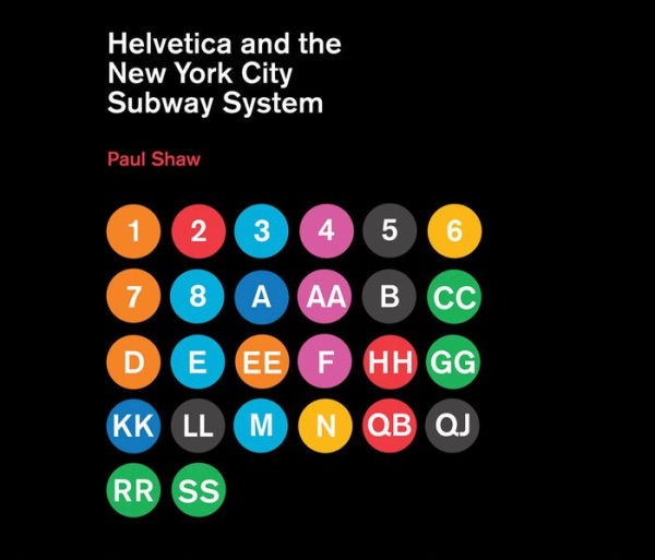
Helvetica and the New York City Subway System: The True (Maybe) Story

- ISBN-10:
- 026201548X
- ISBN-13:
- 9780262015486
- Pub. Date:
- 02/11/2011
- Publisher:
- MIT Press
- ISBN-10:
- 026201548X
- ISBN-13:
- 9780262015486
- Pub. Date:
- 02/11/2011
- Publisher:
- MIT Press
49.95
In Stock

Product Details
| ISBN-13: | 9780262015486 |
|---|---|
| Publisher: | MIT Press |
| Publication date: | 02/11/2011 |
| Series: | The MIT Press |
| Pages: | 144 |
| Sales rank: | 692,815 |
| Product dimensions: | 11.30(w) x 9.70(h) x 0.70(d) |
| Age Range: | 18 Years |
About the Author
What People are Saying About This
From the B&N Reads Blog